
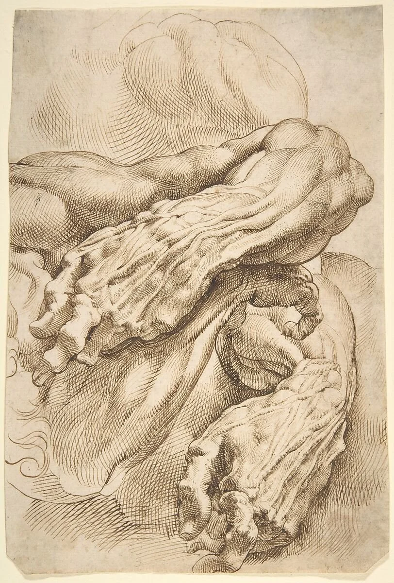
Peter Paul Rubens, Study of an arm (MET Museum, New York). Demonstration of cross hatching techniques in pen and ink.
There is a distinct thrill that comes with putting pen to paper. Unlike charcoal or graphite, which can be smudged, softened, or erased, pen and ink is immediate and unforgiving. Every mark is a permanent commitment. For many artists and students, this permanence is intimidating, but it is exactly this decisive nature that makes pen drawing such a powerful and expressive medium. To truly master the pen, we have to rethink how we approach light, shadow, and form—and some of the best lessons come not from modern illustrators, but from the sketchbooks of the Renaissance.
The Lessons of Silverpoint
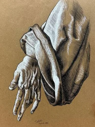
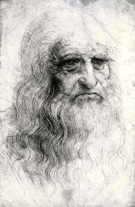
Long before the invention of the steel nib or the modern felt-tip pen, Old Masters like Leonardo da Vinci and Albrecht Dürer utilized a technique called metalpoint, most commonly silverpoint. This involved drawing with a thin stylus of actual silver on paper coated with a slightly abrasive preparation, like bone ash. As the silver dragged across the surface, it left a delicate, permanent gray mark that would slowly tarnish and darken over time.
Silverpoint and pen drawing share a critical limitation: you cannot press harder to get a darker, thicker line. The mark is essentially binary—it is either there, or it isn’t. Because the Old Masters could not rely on smudging or heavy pressure to create soft shadows, they had to rely entirely on line density. By studying Dürer’s or da Vinci’s silverpoint sketches, you can see how they masterfully layered thousands of uniform, delicate strokes to weave light and shadow together. They sculpted faces and drapery purely through the deliberate spacing and crossing of absolute lines. This is the exact mindset required to draw with a pen.
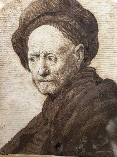
Rembrandt, Pen and ink drawing of an old man. Rembrandt added some ink wash over his marks to add some additional depth and value.
The Illusion of Value
Because ink is solid black and your paper is white, creating value (the lightness or darkness of an object) requires a technique called optical mixing. You are not actually creating gray; you are placing black marks so close together that the viewer's eye blends them with the white of the paper to perceive gray. The closer the marks, the darker the value. The further apart they are, the lighter the value.
Hatching is your foundational tool. This involves drawing a series of parallel lines. If you want a light, subtle shadow on a sunlit wall, you might use widely spaced, thin lines. To deepen that shadow, you simply draw those parallel lines closer together.
Cross-hatching takes this a step further by layering a second set of parallel lines over the first, usually at an angle. To build a very dark, dense shadow—like the deep recesses of a doorway on an old house—you might layer three or four sets of lines, crossing them in different directions until the white of the paper is almost completely consumed by ink.
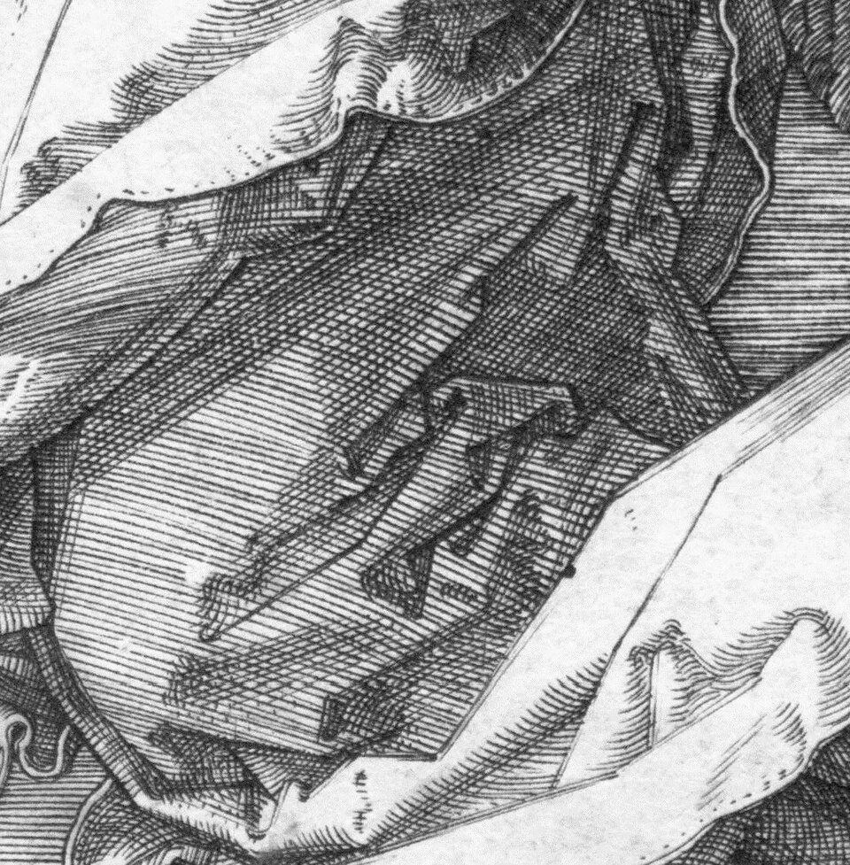
Durer’s hatching and cross hatching technique detail from Veronica
Contour hatching is how you give objects three-dimensional volume. Instead of drawing straight, flat lines, you curve your strokes to follow the physical form of the object. If you are drawing a rounded object, your lines should wrap around its surface like latitude and longitude lines on a globe. This immediately tricks the eye into seeing a 3D form rather than a flat circle.
Stippling, or using clusters of dots, is another brilliant way to build value. While it requires patience, stippling allows for incredibly smooth, photographic transitions from light to dark. It is particularly effective for drawing soft, organic surfaces where harsh lines might feel too aggressive.
Rendering Texture with the Pen
Understanding value is only half the battle; the other half is texture. The way you apply your marks should change drastically depending on the surface you are illustrating.
If you are rendering the weathered wood grain of an old boat, your hatching lines should be organic, jagged, and slightly uneven, following the natural split of the timber. When drawing a braided rope, your lines need to curve tightly around each individual strand to show tension and cylindrical volume. For rendering the reflective surface of metal, you need high contrast: place your darkest, most dense cross-hatching directly adjacent to the stark white of the paper to show a sharp, gleaming reflection. Even the choice of tool matters—a traditional dip pen can offer a bit of line variation, but for consistent, reliable texture building and learning the ropes, an accessible tool like an ultra-fine marker forces you to rely entirely on your spacing and layering rather than the pressure of your hand.
Embracing the Unforgiving Line
The greatest hurdle in pen drawing is the fear of making a mistake. Because you cannot erase, every stray mark stays on the page. But this is exactly what gives pen drawings their vitality and energy. If you draw a line slightly out of place, you do not erase it—you simply draw the correct line next to it and incorporate the "mistake" into your shading. Over time, those extra lines add a rich, vibration-like energy to the piece.
The secret to pen drawing is confidence. Look to the Old Masters, understand that every shadow is just a collection of carefully spaced marks, and allow yourself to build the image one deliberate stroke at a time. Once you stop fighting the permanence of the ink and start using it to construct your values, you will find that drawing with a pen is one of the most rewarding mediums an artist can master.
To begin learning to draw, start to doodle! Get a page of paper and pen and try to make lots of marks and draw lots of things. Don’t allow yourself to use a pencil at all, just doodle away. This will really help you build our confidence and skills in drawing with a pen.

